Hemosphere will eventually be a virtual lab for microfluidic chip or device prototyping. The main goal is to reduce lab development costs and time by offloading parts of the microfluidic device prototype experiments to HPC solutions and making a virtual lab where parts of the experiments can be done.
The users of Hemosphere will be able to set up their experiment by setting fluid properties, materials, external physical forces and chip-prototype geometry just like they would do in a real lab, but in a virtual environment. Simulation models will then run in the background on HPC resources to compute the flow of fluid components and their interactions in the microchannels allowing for a performance assessment of the device.
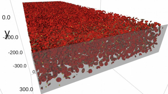
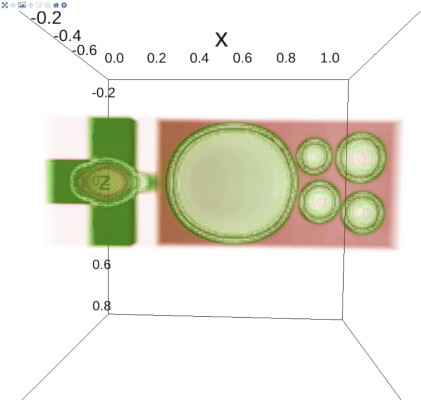
The final resulting data can be post-processed with susipop, a post-processing framework for suspension simulations, followed by visualizing the experiment with susivis (see figure 1 and figure 3). The post-processing results come in the form of dynamic meshes (e.g. blood cells), volumes (e.g. the fluids suspending the bloodcells) and static meshes (e.g. the microfluidic chip or device), including the computed forces and properties on these meshes and volumes.

The post-processing workflow is based on Jupyter notebooks, so one of the requirements was that the interactive 3D visualizations should also be shown within the Jupyter notebook environment through the use of Jupyter notebook extensions. One of the reasons to use the Jupyter notebooks is the ease in which a textual explanation of the data, processing and visualization of the data can be done within one notebook, saved to a notebook file and shared with anyone who might be interested in the results of complex fluid simulations.
Visualization features introduced in susivis are 3D temporal triangle mesh visualization, volume rendering, vector visualization, static STL mesh loading, 3D interactive clipping of the mesh geometry, volume iso-surface extraction and all features not mentioned included in ipyvolume.
Components
The components needed to realize the interactive 3D visualizations within the Jupyter notebooks are ipywidgets, pythreejs, ipyvolume and susivis. Each component is a different abstraction layer within the total Hemopshere visualisation software topology (see figure 2). In this blog, I will give a high-level description of each component, with a bit more detail for ipyvolume and susivis, since these were the components that we worked on during the Hemosphere project.

IpyWidgets and pythreejs
Ipywidgets provide the backbone to allow the creation of custom Jupyter widgets within Jupyter notebooks. Ipywidgets gives template widget models and widget views both for the Python server back-end side and for the Javascript user front-end side. When a widget is created in a Jupyter notebook, ipywidgets creates both a widget model on the back-end and a widget model on the front-end and if needed an associated widget view for the front-end. These widget models on both sides keep their variables in sync through websockets. Whenever data is changed in the server-side Python code, the associated Javascript widget model will update its representation of that data. This way the Python code can interact with the Javascript Jupyter widget in the Jupyter notebook and vice versa.
Pythreejs is a Jupyter widget wrapper library for the Javascript Threejs 3D library. This gives a good basis to create the visualization widgets provided by ipyvolume.
Ipyvolume
In a thorough comparison of different scientific visualization frameworks ipyvolume came out as the most feature complete. Ipyvolume in itself already had the ability to visualize mesh data and to do volume rendering, which were requirements for the Hemosphere project. Through extensive collaboration with the original developer of ipyvolume additional features and changes were made to better suit the requirements of the Hemosphere project.
Ipyvolume provides Figure widgets which can be created similar like Matplotlib figures. The Figure widget contains the core rendering components which are needed to render the interactive 3D visualizations. Then, similar to Matplotlib, additional widgets can be added to the Figure widget such as a volume widget, a scatter widget (3D scatter plot for particles) and a mesh widget. All these widgets can be combined to make an insightful overview of the Hemosphere experiment’s volumetric, geometric and vector data.
Besides being able to visualize volumetric data, mesh data and vector data, ipyvolume has some other features which were very practical for this project:
- Multi-volume rendering, which allows for visualising multiple volumes in one figure even when the volumes overlap.
- Domain zooming, which samples only parts of the volumetric data, which reduces the data that needs to be sent to the user.
- VR, which allows the user to view his visualizations in VR. This feature is still in early stages of development.
Susivis
Susivis is an abstraction layer which contains wrapper functions around ipyvolume that prepares the experiment data. Besides that, susivis adds some additional functionality to ipyvolume by extending it with extra widgets and combining it with VTK (Visualization Toolkit) to do some additional processing.
Susivis added the following features to the already extensive feature list of ipyvolume:
Dynamic temporal meshes. Ipyvolume already provided the ability to plot meshes but those meshes could only be temporally animated when the number of triangles per frame stayed constant. However, susivis needed animation of dynamically changing triangle meshes, so this feature was added.
Mesh vectors. The mesh vectors allow the user to plot arrows on every mesh point to display the forces on these mesh points. This feature is also known as glyphing.
Static STL meshes. One of the applications of the Hemosphere project was to simulate micro-fluidic chips. These chips consist of static geometry and this geometry can be visualized with static STL meshes.
Clipping. Sometimes the amount of geometry within a mesh or the static mesh of the micro-fluidic chip can occlude interesting insights. With the the clipping widget the user can interactively clip away unwanted parts form the geometry of a specific mesh.
Iso-surfaces. A less graphically intense way to visualize volumetric data is to compute an iso-surface from the volume. Given a user-chosen data value an iso-surface will be extracted from te volume and displayed in a mesh widget.

0 Praat mee